Framer for Developers.
Developers can extend Framer’s capabilities with standard React and JavaScript. There are multiple ways to do this:
Basics
There are a few things where code comes into play in Framer. Important things to know before you start working with code in Framer:
Animation
The open source Framer Motion powers the production quality animation and can be used in Framer or any React based project.
Editor
The canvas is rendered using the DOM and React. It can render any custom React component and it handles the measuring of sizes and layout for you.
Canvas Interface
Framer code components can optionally expose UI on the canvas to let anyone configure properties.
SSR
Published projects automatically get pre-rendered for performance and SEO, including custom components.
Because the Framer canvas is based on the DOM and rendered with React, you can create your own React components and allow users to configure your props visually. Alternatively, you can modify props for any element on the canvas using overrides. Typical use cases are:
Create a navigation login button that knows your current login state.
Create a custom form with logic and validation.
Show a text field with live custom data from an API.
Add a WebGL animation to a canvas element.
Custom Page Code
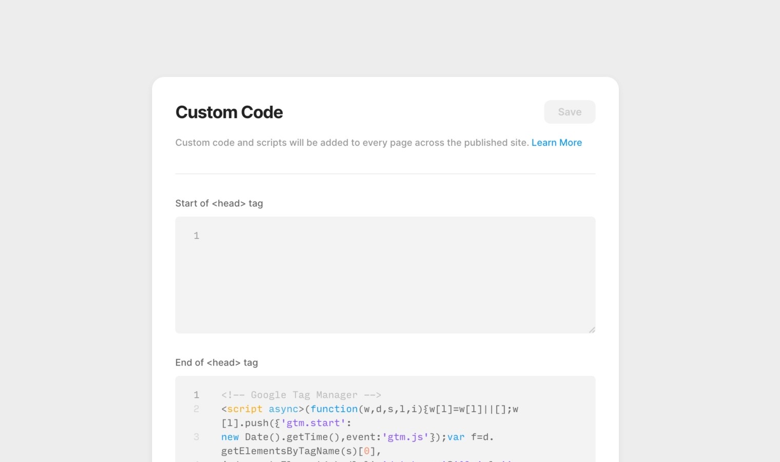
You can insert custom code at the start or end of the <head> and <body> tag of your site. Custom code and scripts will be added to every page across the published site. These changes will not be visible in your preview, only in the published site.
In order to insert custom code, click on the name of the project to access the Site Settings and scroll down to the Custom Code section.
HTML, CSS, and Javascript are supported. The following tags are allowed: <link>, <script>, <meta>, and <style>. You will not be able to integrate any server-side languages, such as Perl, PHP, Python, or Ruby. Learn more about custom page code on our learn page.
Code Overrides
Code overrides are small functions that you can modify properties for any element. You can apply them to any element on the canvas, but the effects are only visible in the preview.
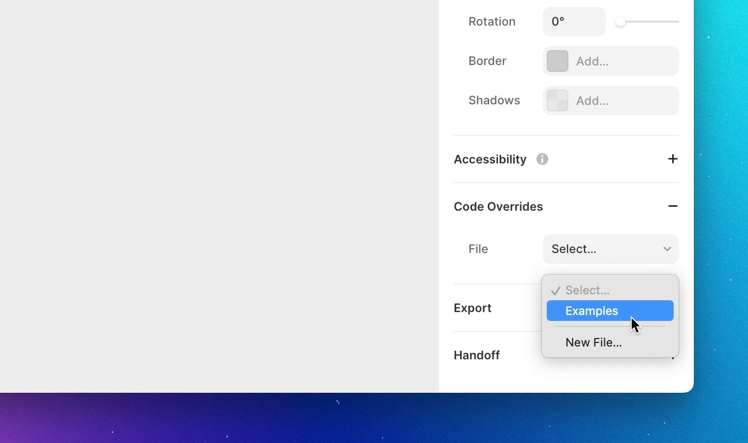
You can create overrides directly inside Framer. Go to the properties panel and create a new file under the Code Overrides section.
Example
The code is essentially the same as a React Higher Order Component. The example below modifies the opacity property of the element it is applied to. Framer uses TypeScript types to detect your overrides, hence the ComponentType.
Now that you have your new override, you can apply it to any element on the canvas from the same section in the property panel. If you now preview or publish the site, the element will have an opacity of 0.5.
Text Content
A popular use case is to replace text contents for any text element. You can use the text property to pass in any text content. The preview or published site will now show “Hello World”.
Tags
You can also use overrides to add custom tags to elements. For example if you want to add a class or id tag to elements, you can do something like:
We don’t recommend to override core attributes like class or className as Framer relies on those and it will result in breaking styling.
Code Components
Code Components can extend Framers capabilities by rendering any React Component directly on the canvas. Framer has a built in code editor to write them directly in Framer.
Framer components are just plain React components, but they have a few optional extras:
Basics
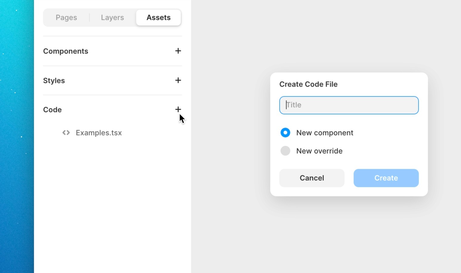
To create a new code component, go to the assets panel and select Code. Then, click Create Code File. You'll be presented with a new code file that exports a single React component.
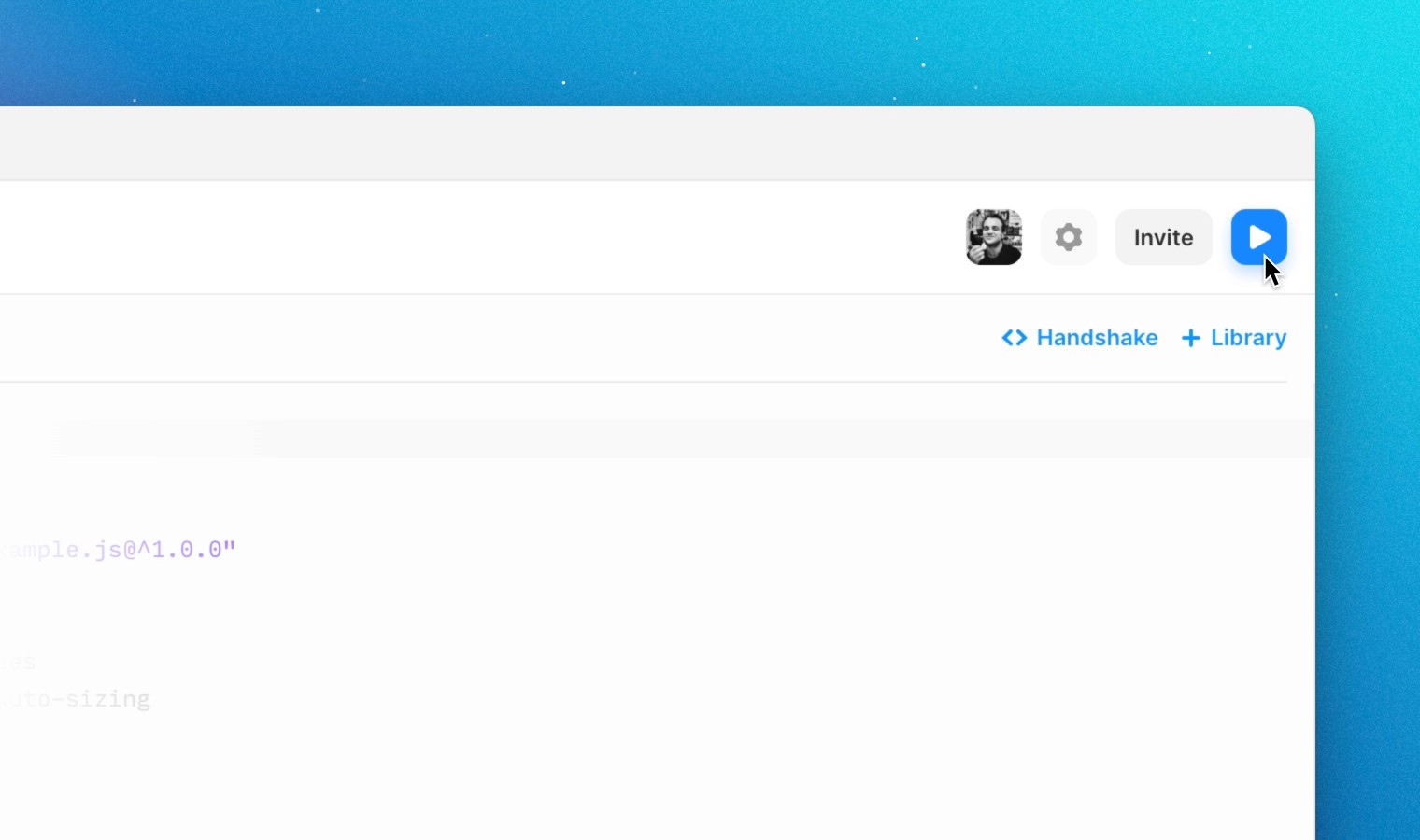
To preview your component in real time while editing, click the top right preview button to get a split preview of your work.
If you switch back to Components, you'll see the component (named after your choice) which you can now drag onto the canvas as often as you like.
Example
Let's look at the very simplest component we could make. That would really just be a vanilla React button component. There really is no magic here, but it already works.
Let’s go a step deeper and add some styling. We can do this the standard React way too with style.
Now, let’s make a title prop that is configurable from the interface (we will explain more about property controls later).
And there your have a simple configurable React component, right on the canvas. But I hope you can see how you can use the same concepts to build any React component you like. title prop that is configurable from the interface (we will explain more about property controls later).
Auto-Sizing
Framer has the ability to accurately measure any content on the canvas. When building code components this means you can write styles as you are used to on the web and Framer will figure out the rest.
Defining Component Size
There are four settings for code component layout in Framer: auto, fixed, any, and any-prefer-fixed. These can be set for width or height axis individually, using @framerSupportedLayoutWidth and @framerSupportedLayoutHeightannotations.
auto — The component will dictate its own size.
fixed — The component is in a fixed size container and can fill 100% of its width & height.
any — The user can switch between auto and fixed sizing by using the controls in the properties panel. It will insert with its sizing set to auto by default.
any-prefer-fixed — The same as the any option however it will insert with its sizing set to fixed by default.
Specifying Options
The default layout setting for all components in Framer is any. To select different layout options for your component you'll need to add an annotation. This annotation is a special comment that Framer reads and uses to accordingly set options for your component. Make sure this comment is on the lines directly above where you declare your component.
The following code will make your component have auto-sizing for width, but not height. You can make these two properties any combination of sizing options as long as you have both width & height specified at all times.
Intrinsic Size
These annotations let Framer know what size your component should be inserted into the canvas when fixed sizing is enabled. In this case, it will insert with a width of 200px and a height of 200px.
Using Auto-Sizing
Now, let’s make a title prop that is configurable from the interface (we will explain more about property controls later).
Supporting the default any
By spreading the style prop into your parent container style properties with {...style}, Framer will override the width and height when auto-sizing is turned off (fixed sizing) by passing down { width: "100%", height: "100%" } via the style prop. While doing this, Framer wraps your component in a fixed-sized container set to the user-defined size on the canvas.
Auto-Sizing Dynamically
If you want to auto-size your component based on logic or state changes, using a useLayoutEffect will work best with our measuring system. Generally you'll want to use this approach when controlling internal state from outside the component.
Measuring Absolute Height Width Values
Sometimes when writing components you may want to know the size of the component in pixels. To do this you will need to measure the component with a resizeObserver. Be careful, as this will reduce the performance of your site, as well as your canvas.
Property Controls
Property Controls allow users to pass properties (or props) to a code component through the Framer interface. When a user selects a code component on the canvas, its Property Controls are visible on the properties panel. As a component author, it’s up to you to decide which Property Controls to add and what options they should present to the user.
Adding Controls
To give your component Property Controls, import both the addPropertyControls function and the ControlType type from the framer library.
Below your component, call the addPropertyControls function with two arguments: first, the name of your component; and second, an object that defines controls for different properties. You have several types of controls to choose from, each of which are documented on this page.
Property Controls only affect components on the canvas. For this reason, you'll still want to use defaultProps for your component’s props, both to prevent errors as you code the component and when a designer creates an instance of your component from code.
In this example, we’re adding a Property Control for our component’s text prop. On the canvas, selecting the component will now display a control that allows us to set this property.
Hiding Controls
Controls can be hidden by adding the hidden function to the property description. The function receives an object containing the set properties and returns a boolean. In this example, we hide the text property entirely when the connected property (the toggle) is false.
Now you can toggle the visibility of the text property control by changing the toggle boolean from within the property panel in Framer.
Adding Descriptions
Controls can have a description property to add documentation about the control in the Framer UI—it appears in the Properties panel just above the control. It also supports adding emphasis and links using Markdown syntax. To add line breaks, use the newline character “\n”.
Controls
Array controlType.Array
A control that allows multiple values per ControlType, provided as an array via properties. For most control types this will be displayed as an additional section in the properties panel allowing as many fields to be provided as required.
For a ControlType.ComponentInstance the component will also gain an additional outlet control on the Canvas that allows links to be created between frames.
Group properties together by using an object control.
For multiple ControlType.FusedNumber values, you can pass in an array of single values as the React default prop.
Boolean controlType.Boolean
A control that displays an on / off checkbox. The associated property will be true or false, depending on the state of the checkbox. Includes an optional defaultValue, which is set to true by default. You can also customize the labels displayed in the property panel with the enabledTitle and disabledTitle properties.
Color controlType.Color
A control that represents a color value. It will be included in the component props as a string. This control is displayed as a color field and will provide the selected color in either RGB (rgb(255, 255, 255)) or RGBA (rgba(255, 255, 255, 0.5) notation, depending on whether there is an alpha channel.
ComponentInstance controlType.ComponentInstance
A control that references to another component on the canvas, included in the component props as a React node. The component will have an outlet to allow linking to other Frames. Available Frames will also be displayed in a dropdown menu in the properties panel. The component reference will be provided as a property. As a convention, the name for the property is usually just children.
Multiple components can be linked by combining the ComponentInstance type with the ControlType.Array.
Date controlType.Date
A property control that represents a date. The date will be passed in as an ISO 8601 formatted string.
Enum controlType.Enum
A property control that represents a list of options. The list contains primitive values and each value has to be unique. The selected option will be provided as a property. This control is displayed as a dropdown menu in which a user can select one of the items. displaySegmentedControl can be enabled to display a segmented control instead.
Note: ControlType.SegmentedEnum is deprecated, please use ControlType.Enum and enable displaySegmentedControl.
EventHandler controlType.EventHandler
A control that exposes events in the prototyping panel within the Framer UI. When choosing an event from the prototyping panel, you can select from a list of actions to trigger.
File controlType.File
A control that allows the user to pick a file resource. It will be included in the component props as a URL string. Displayed as a file picker that will open a native file browser. The selected file will be provided as a fully qualified URL. The allowedFileTypes property must be provided to specify acceptable file types.
FusedNumber controlType.FusedNumber
A control that can be used to take a single number or four distinct numeric input fields. The typical use case for this control is for visual properties like border, padding or margin. It will display an input field to accept a single value, alongside a segmented control allowing four distinct values to be provided.
You can also set the default value for each valueKey as well as the toggleKey by setting their values on defaultProps.
Image controlType.Image
A control that allows the user to pick an image resource. It will be included in the component props as an URL string. Displayed as an image picker with associated file picker. The chosen asset will be provided as a fully qualified URL.
Number controlType.Number
A control that accepts any numeric value. This will be provided directly as a property. Will display an input field with a range slider by default. The displayStepper option can be enabled to include a stepper control instead.
Object controlType.Object
A control that allows for grouping multiple properties as an object.
String controlType.String
A control that accepts plain text values. This will be provided directly as a property. Will display an input field with an optional placeholder value. If obscured attribute is set to true a password input field will be used instead of a regular text input so that the value in the input will be visually obscured, yet still be available as plain text inside the component. displayTextArea can be enabled to display a multi-line input area instead.
Transition controlType.Transition
A control that allows for editing Framer Motion transition options within the Framer UI.
Code Component Sharing
Code components are built on ES Modules. That means that every code component has a unique url that can be shared. If Framer detects a paste with a code component url, it automatically adds the component to your project and places an instance on the canvas. Find your code component under Assets → Code Component and right click to “Copy URL…”. Now your clipboard will contain a url like:
You can paste this url into any Framer project.
FAQ
Should I use code in Framer?
Framer is a site builder that doesn't require code. Code in Framer is a way to extend the application beyond that standard (very extensive) functionality.
You should use code in Framer if you are comfortable with React and JavaScript and need to add something dynamic to your website that Framer cannot provide out of the box, like a menu login button, a custom form, or a metric integration.
Is Framer a full blown developer platform? Can it help me write code?
No. Framer uses code as an escape hatch to extend capabilities to for example add small dynamic parts to a site. If your project needs a lot of logic and components we advice to create a normal React application instead.
What happens if I make a bug in my custom code?
Code in Framer shares the runtime and dom with everything else. That means that you can do anything, but also that subtle bugs can break your entire site. In short, with great powers comes great responsibility and we advice to only use it for production projects if you’re comfortable writing production quality code.
My custom code isn’t working as expected, can you help me debug?
Unfortunately we don’t have the resources to support your custom code for obvious reasons, but our #developers community channel channel is very popular and a great place to ask questions.
Can share my code components across projects?
Yes. You can simply copy and paste code components across projects and it will work. If you have a set of components that you would like to share with your team, you can organize them in a central project or even publish them as a mini website. If you write the component url to the clipboard, Framer can paste it and will load your component.
Can I import Framer components into my React application directly?
Framer components are React Components based on ES Modules. That means that you can technically import them into other projects, but in reality there are quite a few hurdles to overcome, so we only recommend this for testing or if you really know what you are doing.
We have been experimenting making the experience easier for this with a beta feature called Handshake. But as this relies on the Next.js compiler which is currently being rewritten and browser features that aren't broadly supported yet, you should consider this very experimental for some time.
Can I import npm packages?
Importing npm packages is currently an experimental feature. Most packages typically don’t work unless unless they were built specifically for Framer. Some projects with multiple npm imports may run into errors with adding multiple npm dependencies, as sub-dependency conflicts can occur.
Should I use external code libraries with Framer?
Framer can import any ES Module based code. But the code itself generally is only useful in Framer if it’s made for Framer. So importing large libraries that did not have Framer as the main use case in mind will likely not yield the expected results.
Should I add state management to let different components communicate to each other?
This may be alright in some cases, but if you need to do advanced logic, you are often better off with a real React application. Both Framer and your state management will try and control components, and conflicts can cause subtle bugs.
Should I use code to integrate tokens or build design systems for my team?
No. While many designers dream about a deeper design and production integration with code, Framer is not currently setup to get great results for that use case.


