Stack and Grid
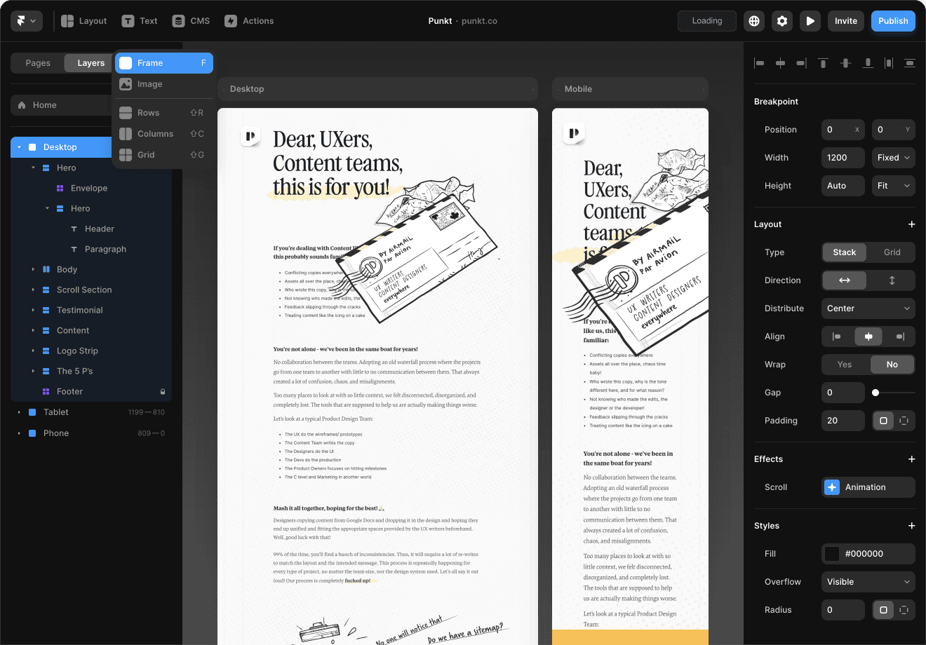
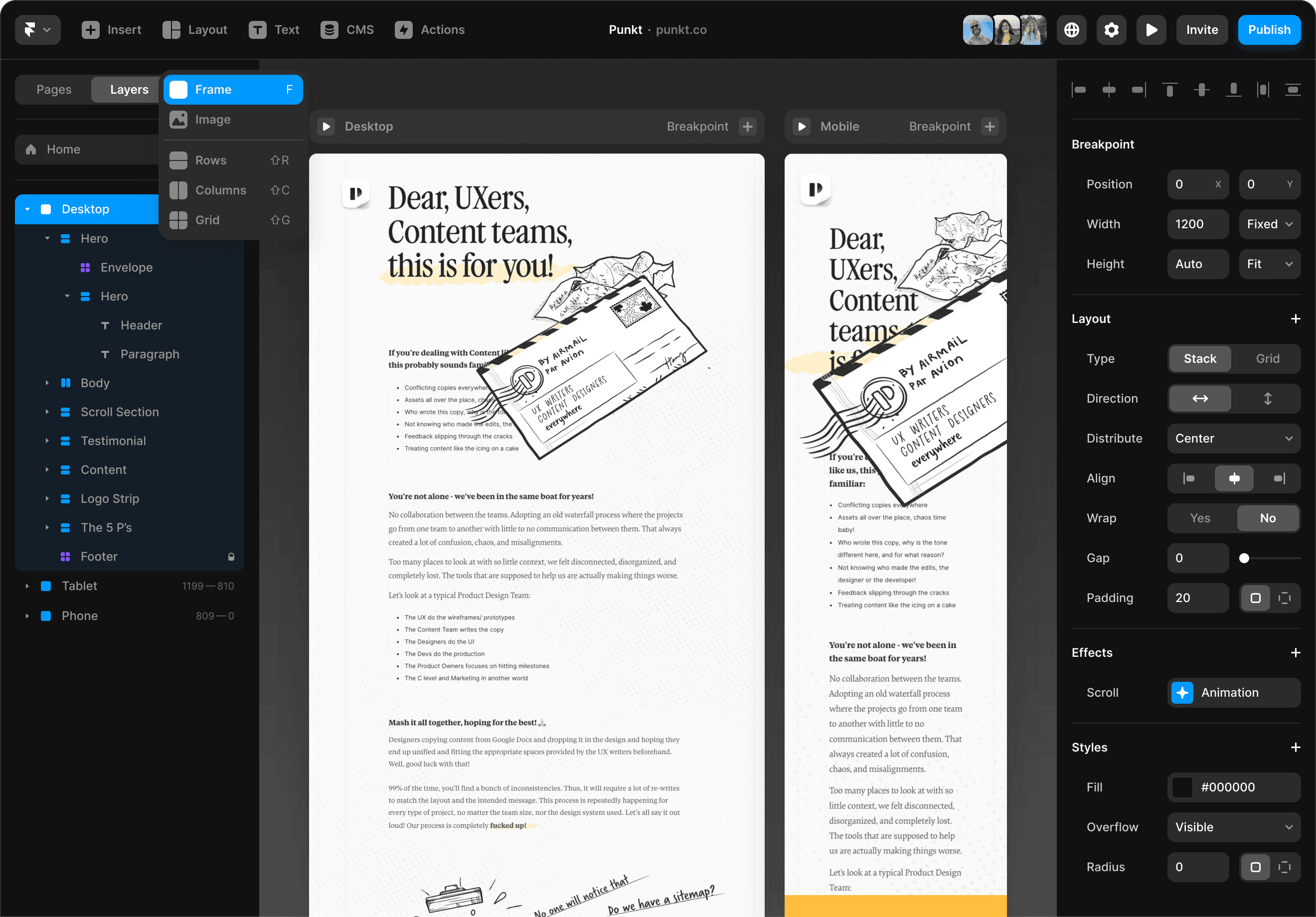
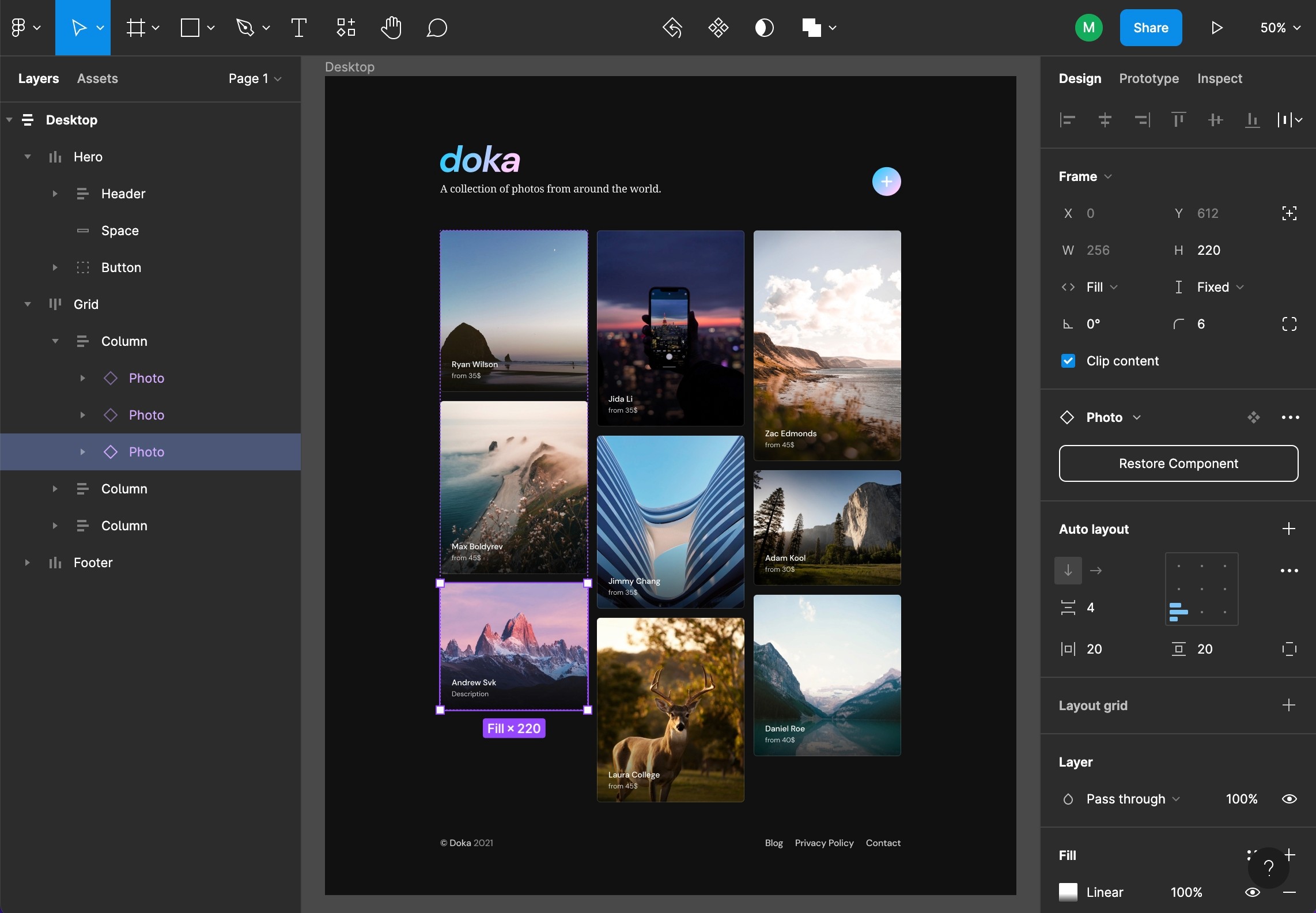
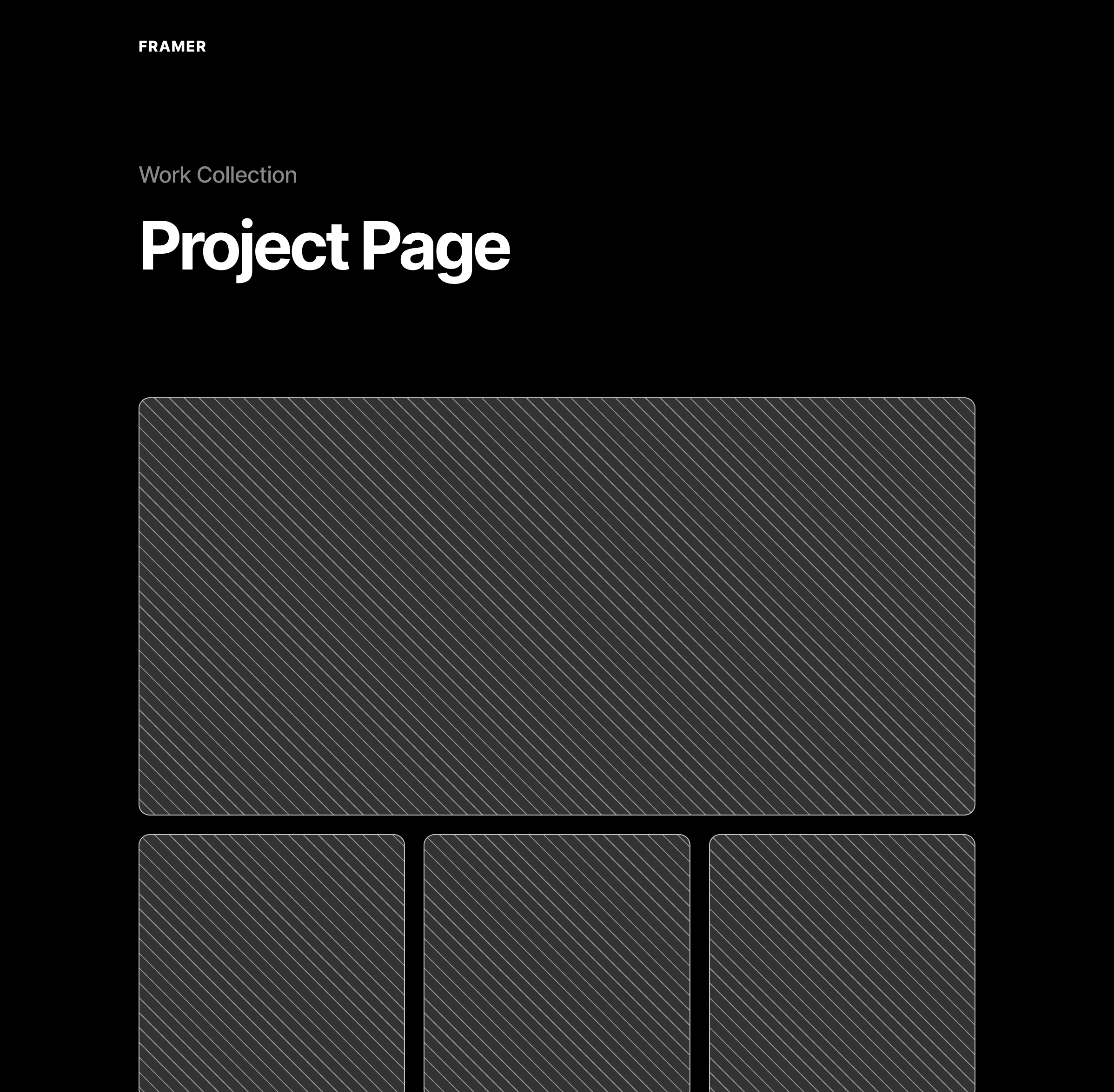
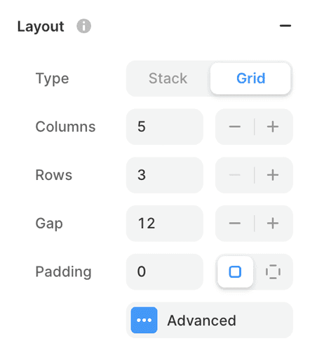
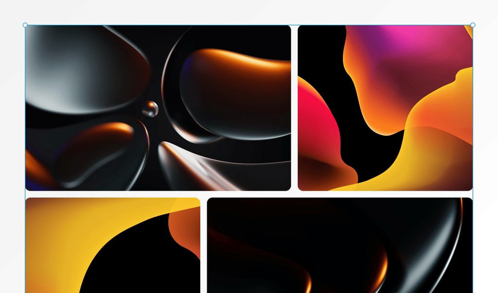
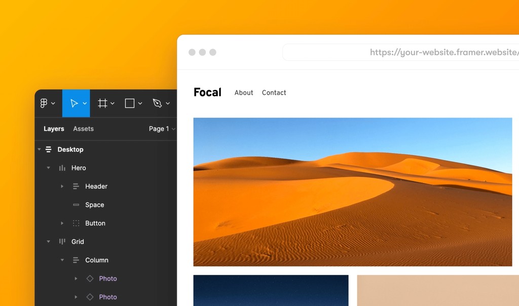
Stacks and Grids are important tools for making designs that look good on any screen. Stacks are like layers stacked up, and Grids are a structured layout. They help designers create websites that work well on different devices.
These tools are crucial for responsive design, making sure your design looks good on big and small screens. Stacks and Grids keep things organized and make your website user-friendly.
In web design, using Stacks and Grids is a must. They not only help your design look neat but also ensure it performs well on search engines. So, when people search for attractive and adaptable web layouts, your site stands out.
Freeform canvas
The freeform canvas in Framer allows you to express your creative ideas freely, as it does not impose any constraints on pre-set layouts or box models, thus giving you the flexibility to design in the way you want.
The freeform canvas is similar to other design tools you may be familiar with, such as Adobe XD, Sketch, and Figma; it provides flexibility and freedom to create unique designs tailored to your needs and creativity.
Figma Copy Paste
The ability to copy and paste web designs from Figma to Framer is a convenient feature for designers who already have a website design in Figma and don’t want to start from scratch. With this feature, you can copy your designs from Figma, seamlessly transfer them to Framer, and publish your design as an actual website without requiring manual rebuilding or using code. This helps to save time and effort and allows you to focus on the creative aspects of your work.
Breakpoints
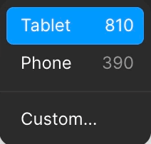
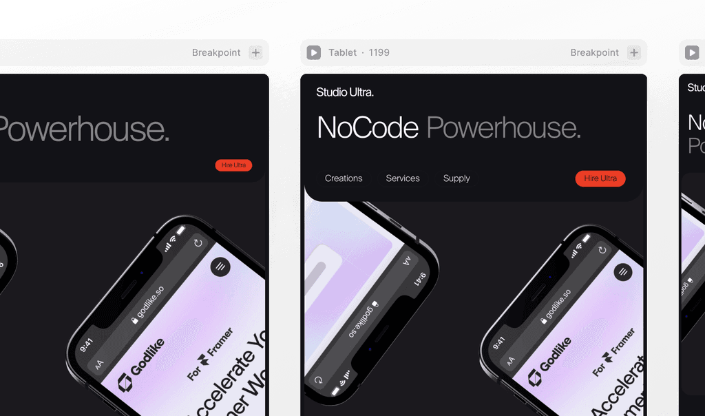
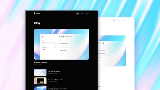
Breakpoints in Framer allow you to create responsive designs that adapt to different screen sizes, ensuring an optimal experience on any device. Breakpoints are visible on the canvas side by side; this allows you to compare and adapt faster than any visual site builder.
Insert Pages and Sections
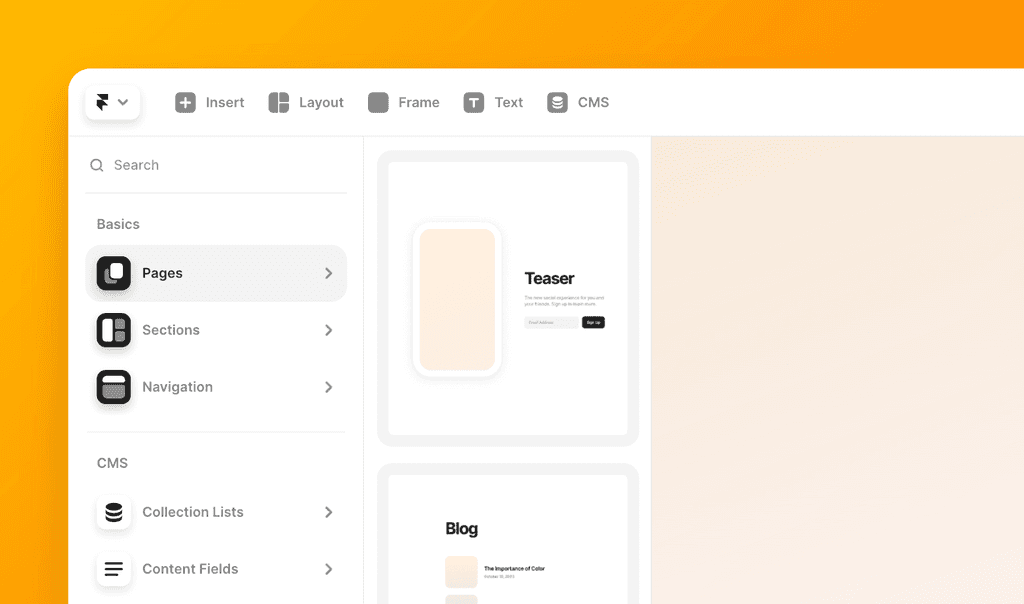
Make your website building process a breeze with our ready-to-use Framer sections. These sections are like pre-designed building blocks that you can easily add to your project, saving you time and effort.
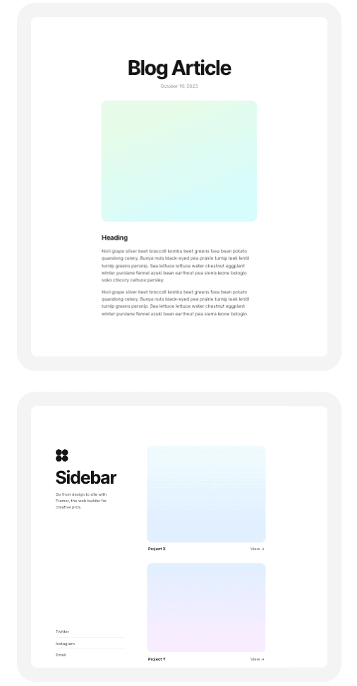
Insertable Pages & Sections are very simple and versatile. They come in common layouts for landing pages, portfolios, and teaser pages, providing a solid starting point for your Framer site. They have a clean and basic style, ready for you to customize and make your own.
Instead of starting from scratch, you can insert a section that fits your needs. It’s a practical way to achieve a professional-looking site without the complexity. And, of course, you have the freedom to adjust things to match your unique style.
Pinning
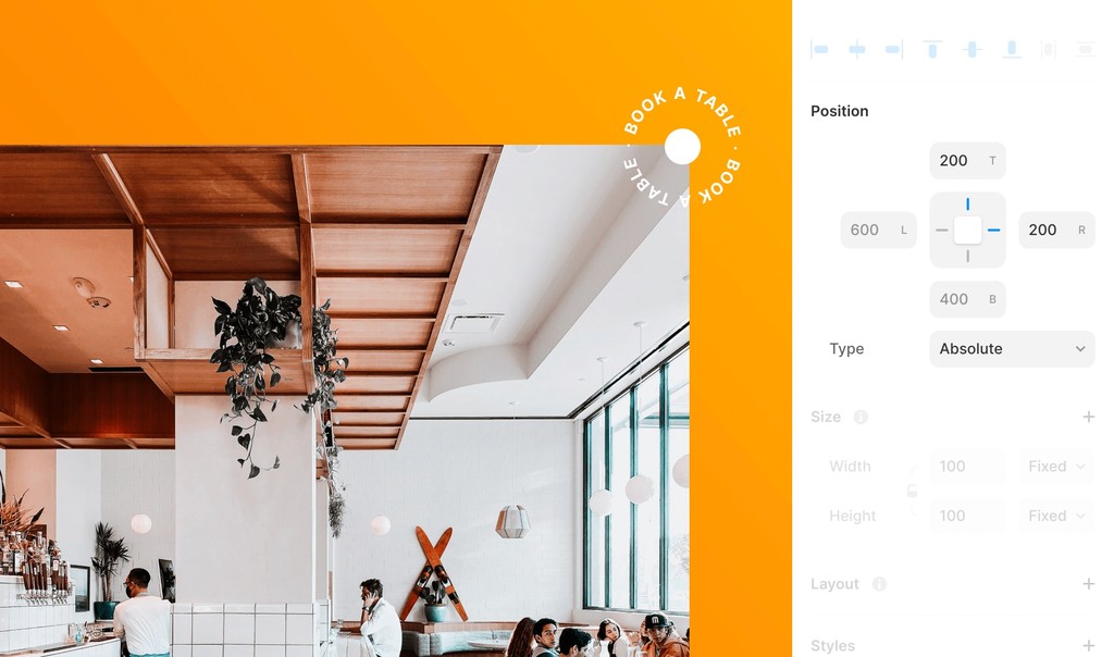
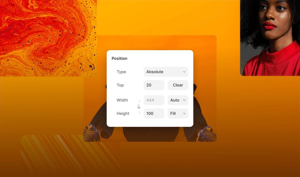
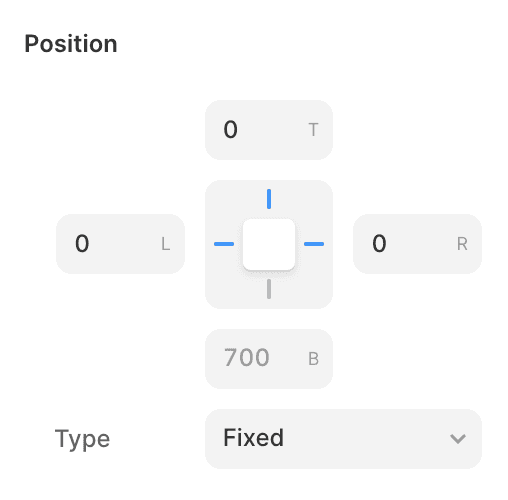
Use layout pinning to design more imaginative layouts that scale. With Framer’s pinning feature, you can secure your elements and sections in place, ensuring they adapt to your layout when the viewport size changes. You can even put absolute elements inside stacks and grids, ignoring the flow of things and pinning it to a specific position.
Position
30
600
600
30
Styling
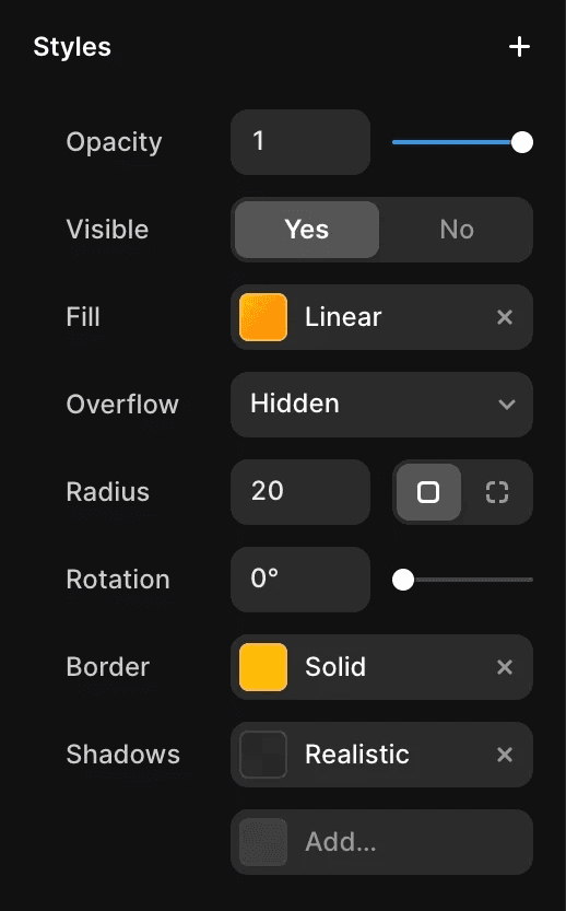
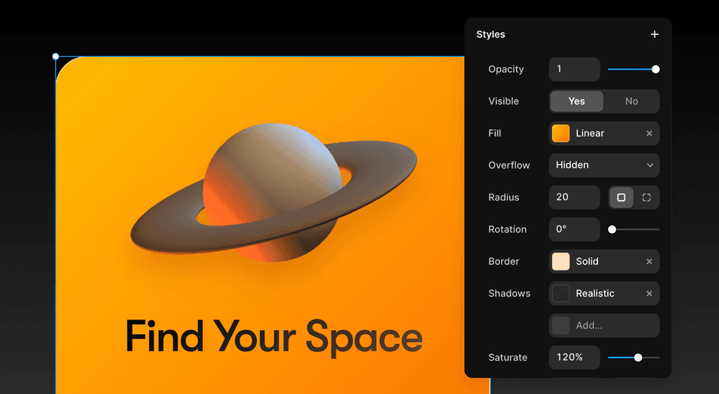
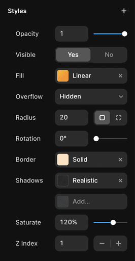
Style every layer on your site using simple property controls like fills, borders, filters, and even realistically rendered shadows. Use Text Styles and shared colors to style your pages throughout your entire project consistently.
Positioning
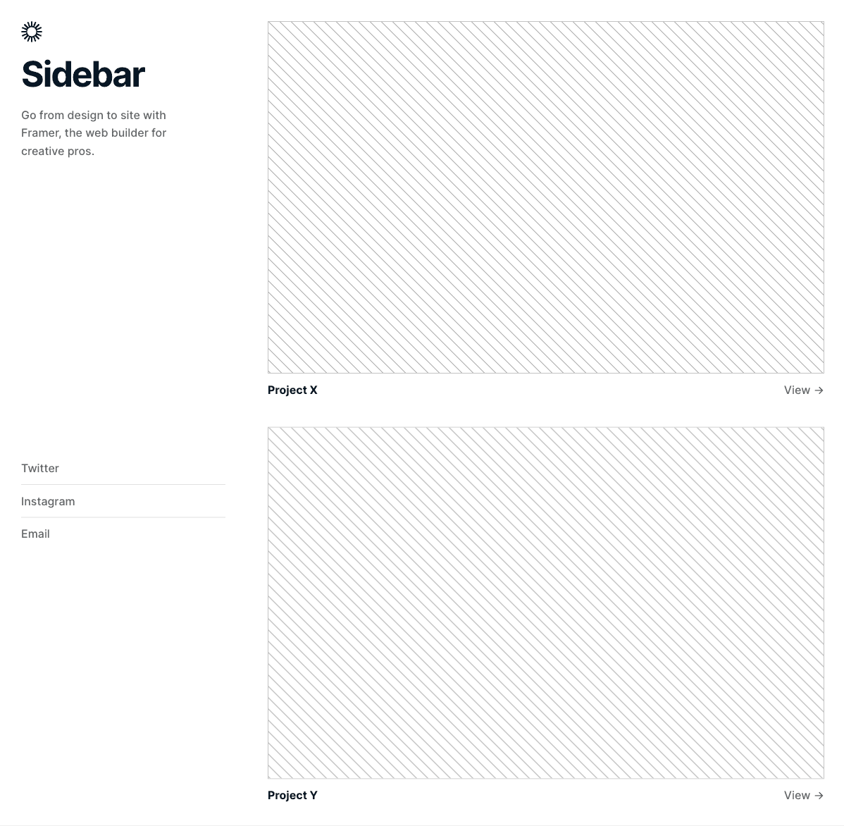
Use positioning options to fix navigation bars, sidebars, badges, and backgrounds. Pin layers to the Viewport regardless of your page set-up, or use absolute positioning within Stacks to break out of its flow.
Light and Dark Mode
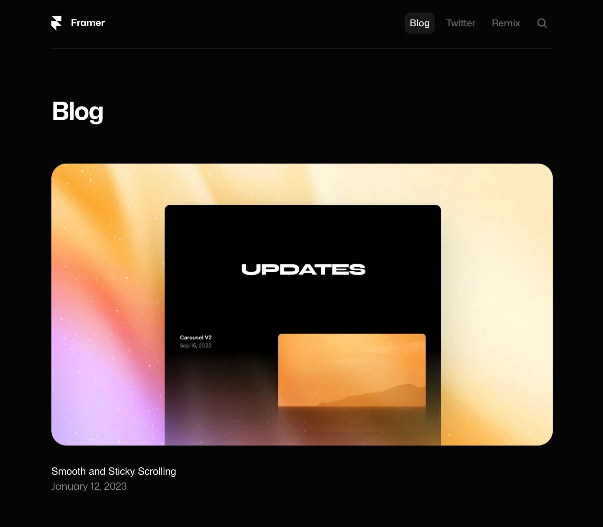
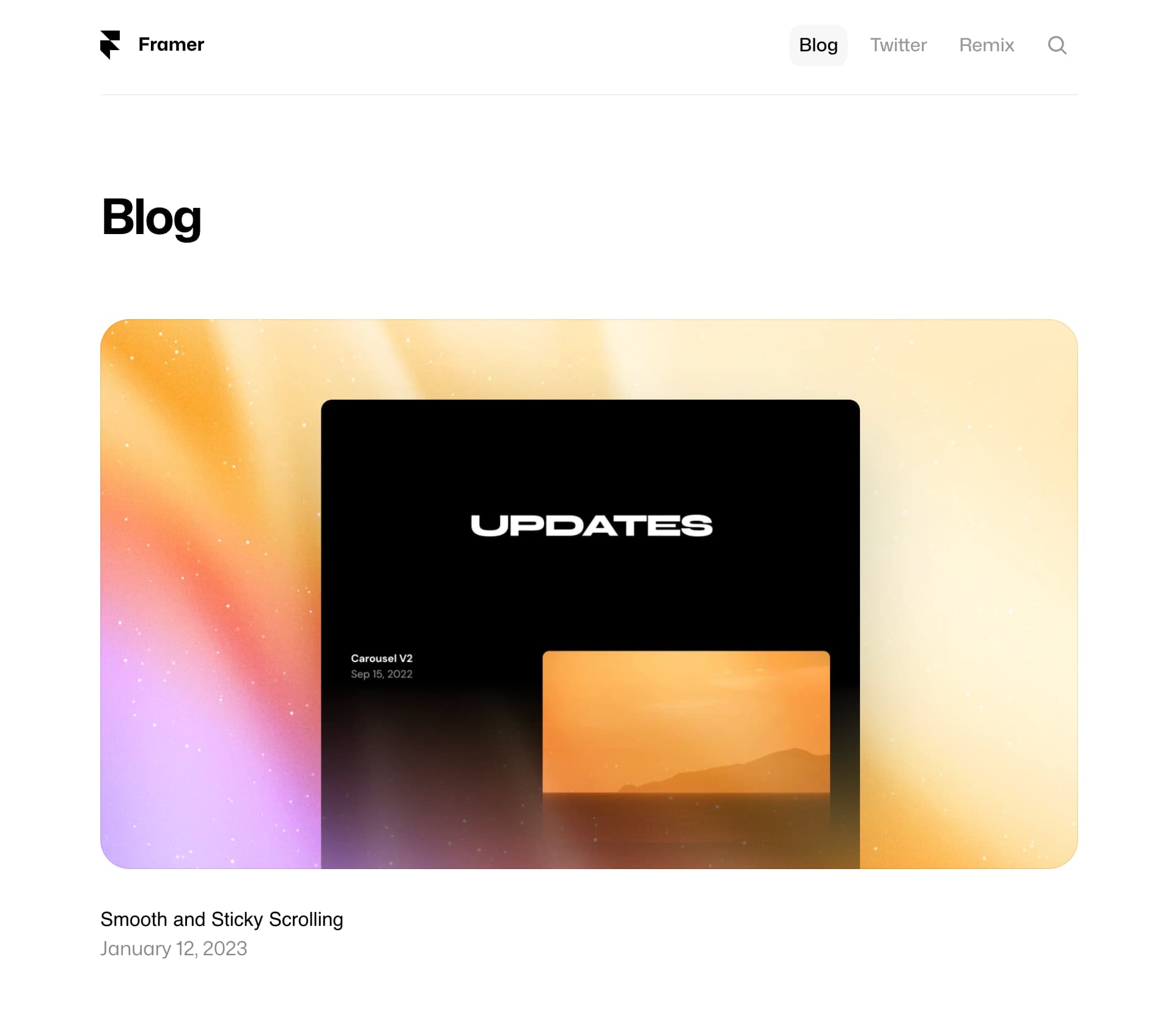
Add a Color Style, define a Light and Dark Theme, then use the Styles throughout your project. Color Styles with Themes even work within interactions and animations—from Effects to Components.
Built-in Fonts
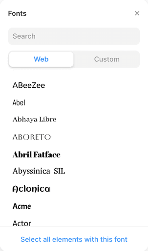
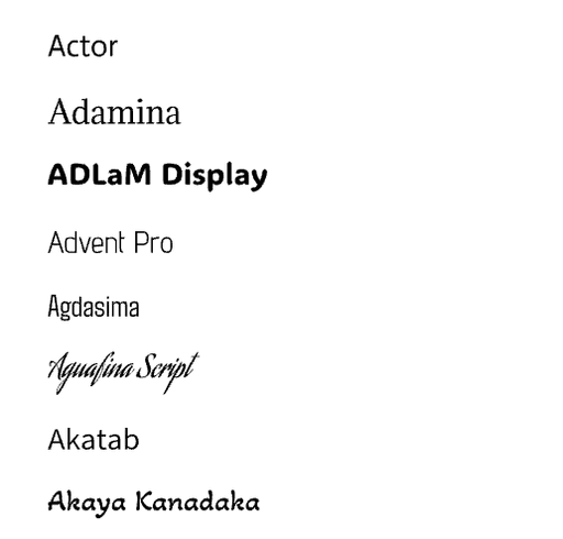
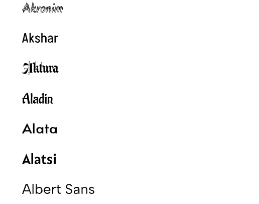
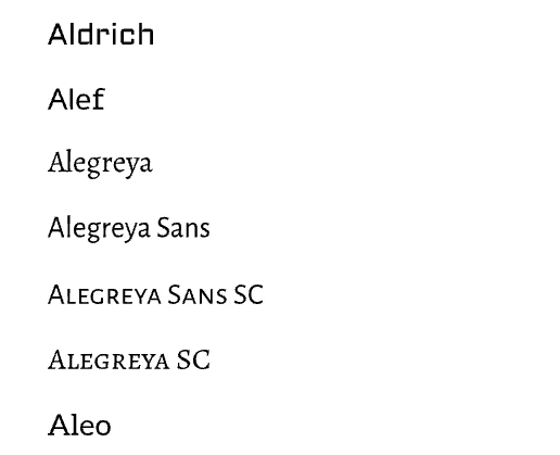
Framer lets you choose from its built-in web fonts or pick from Google Fonts and Fontshare to style your designs.
